Your Cover Is Your First Manuscript Assessment
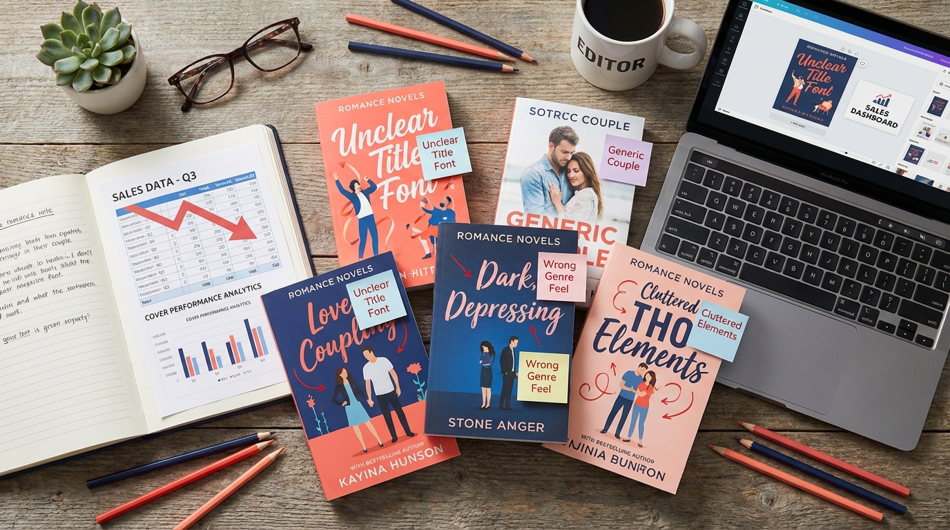
After fifteen years of editing romance novels, I've learned something that might surprise you: readers judge your writing quality by your cover before they ever read a single word. When I receive manuscripts from authors struggling with sales, I always ask to see their covers first. Nine times out of ten, the problem isn't their storytelling—it's the romance book cover design mistakes that are screaming "amateur" to potential readers.
Think about it: your cover is doing the selling when you're not there to pitch your book. It needs to communicate genre, quality, and story promise in a split second. Yet I see talented authors sabotaging themselves with covers that either mislead readers about their content or signal poor production quality.
Let me share the five most damaging romance book cover design mistakes I encounter, along with practical solutions that can transform your sales.
Mistake #1: Genre Signal Failures That Confuse Your Ideal Readers
Last month, an author sent me her contemporary romance manuscript for editing, confused about why her book wasn't finding readers. One look at her cover told the whole story—it looked like literary fiction. Muted colors, artistic typography, and a lone woman staring pensively into the distance. Beautiful? Yes. Romance? Not at all.
Romance readers are incredibly savvy about visual cues. They can spot their subgenre from across a digital bookstore. Contemporary romance covers typically feature bright, warm colors and couples in modern settings. Historical romance showcases period clothing and elegant fonts. Paranormal romance goes darker with supernatural elements.
How to Fix Genre Signal Problems:
- Study bestselling covers in your specific subgenre, not just "romance" in general
- Note the common color palettes, font styles, and imagery
- Test your cover with romance readers—if they can't identify the subgenre immediately, you need changes
- Remember: standing out is good, but misleading is deadly
Mistake #2: Typography Disasters That Scream Amateur Hour
Nothing kills credibility faster than poor typography choices. I've seen manuscripts with gorgeous stories paired with covers using default system fonts, illegible scripts, or—my personal nightmare—Comic Sans. Your font choice communicates as much about your book's quality as your story does.
The most common typography mistakes I encounter include fonts that are too small to read on mobile devices, scripts that are beautiful but illegible, and mixing too many font families. Remember, many readers discover books on their phones first—if they can't read your title clearly on a small screen, you've lost them.
Typography Solutions That Work:
- Invest in professional fonts—sites like Creative Market and MyFonts offer affordable options
- Limit yourself to two font families maximum: one for the title, one for the author name
- Test legibility at thumbnail size—this is crucial for online sales
- Ensure sufficient contrast between text and background
- Consider how your font choice reinforces your subgenre signals
Mistake #3: Color Psychology Mistakes That Repel Your Target Audience
Colors have psychological associations that romance readers respond to instinctively. I learned this lesson when reviewing covers for a client writing steamy contemporary romance. Her original cover used cool blues and grays—colors associated with sadness or corporate environments. After switching to warm oranges and deep reds, her click-through rates improved dramatically.
Each romance subgenre has established color expectations. Sweet romance often uses pastels and bright, cheerful tones. Dark romance embraces blacks, deep reds, and moody purples. Contemporary romance loves vibrant, energetic colors that suggest fun and passion.
Color Strategy for Romance Covers:
- Research color psychology for your specific subgenre
- Consider seasonal associations—soft greens for spring romance, rich golds for holiday stories
- Test different color combinations with your target readers
- Remember that colors display differently on various devices—check your cover on multiple screens
Mistake #4: Model and Pose Problems That Kill Credibility
Stock photo models can make or break your cover, and I've seen some spectacular failures. The worst romance book cover design mistakes in this category include models who look uncomfortable, poses that seem unnatural, or worst of all—using the same overused stock photos that appear on dozens of other covers.
I once worked with an author whose cover featured a couple in formal business attire for her small-town romance about a mechanic and a baker. The disconnect was jarring. The models need to match your characters and story setting, not just look attractive.
Model Selection Best Practices:
- Choose models whose age, ethnicity, and physical characteristics match your characters
- Ensure clothing and setting match your story's time period and location
- Look for natural, comfortable poses that suggest chemistry
- Use reverse image searches to avoid overused photos
- Consider illustrated covers if finding the right models proves challenging
Mistake #5: Ignoring the Professional Standards Checklist
As an editor, I've developed a quick checklist for evaluating covers that directly correlates with manuscript quality perception. When covers fail these basic professional standards, readers assume the interior content will be equally problematic.
The most critical elements include proper resolution for print and digital formats, consistent branding across series, appropriate genre signals, and technical quality that matches traditionally published books. Many indie authors overlook these details, not realizing how much they impact reader perception.
The Editor's Professional Cover Checklist
Here's the checklist I use when evaluating covers for the authors I work with:
Technical Standards:
- Resolution: 300 DPI for print, appropriate pixel dimensions for digital platforms
- Spine design for print versions
- Text legibility at thumbnail size
- Consistent quality across series
Genre and Market Alignment:
- Clear subgenre signals
- Age-appropriate imagery and fonts
- Heat level indication through visual cues
- Competition analysis—fits market expectations while standing out
Professional Polish:
- High-quality imagery without pixelation or distortion
- Professional typography treatment
- Balanced composition
- Consistent author branding
Moving Forward: Your Cover as a Sales Tool
Remember, your cover isn't just decoration—it's your most powerful marketing tool. In my experience editing hundreds of romance novels, I've seen how the right cover can transform a book's reception. Readers want to fall in love with your story, but first, your cover needs to invite them in.
Don't let romance book cover design mistakes sabotage the beautiful story you've worked so hard to create. Whether you're working with a designer or creating covers yourself, understanding these common pitfalls will help you make informed decisions that serve your book and your readers.
Your writing journey is valuable, and your stories deserve covers that reflect their quality. Take the time to get this crucial element right—your future readers will thank you for it.
Frequently Asked Questions
How important is the book cover compared to the actual story quality?
While story quality determines long-term success and reader loyalty, your cover is what gets readers to try your book in the first place. A great story with a poor cover may never find its audience, while a mediocre story with an excellent cover will at least get readers to sample it.
Should I hire a professional cover designer or can I create my own romance book cover?
If you have design skills and understand your subgenre's visual conventions, you can create your own cover. However, most authors benefit from hiring professionals who understand romance market expectations and have access to high-quality stock photos and fonts.
How do I know if my romance book cover is targeting the right subgenre?
Test your cover with avid romance readers in your target subgenre. Show them your cover without the title or blurb and ask what subgenre they think it represents. If they consistently guess wrong, your cover needs adjustment.
What's the biggest cover mistake that instantly marks a book as amateur?
Poor typography is the fastest way to signal amateur status. Illegible fonts, text that's too small for mobile viewing, or using default system fonts immediately tell readers the book wasn't professionally produced.
Ready to Take Your Manuscript to the Next Level?
As a developmental editor specializing in romance fiction, I help authors strengthen their stories, deepen their characters, and polish their prose. Let's work together to make your book shine.
Learn About My Editing Services →